
+1 with @Stiltskin. I think the panda is a bit too big. Also my order of preference is Swoosh, Strip, Battleship, Splash.
I like them though.
CityCyclingEdinburgh Forum » Cycling News
The New CCE Jersey Thread
(84 posts)-
Posted 10 years ago #
-
I'd be fine with CCE on the front so long as it is given space to 'breathe'. In fact, that actually makes sense given that CCE is easier to scan for head-on passes.
How about reducing the size of the panda somewhat and then swapping its position with citycyclingedinburgh?
Posted 10 years ago # -
I like the first splash better than the second, both colour and design.
Posted 10 years ago # -
+1 for jdanielp's suggestion on revised panda habitat.
Posted 10 years ago # -
Something more like....
?
Posted 10 years ago # -
I Like.
(Not convinced by the colours, but according to Ms DarkerSide based on past performance I should never trust my own judgement on that, so willing to go with the majority...)
Posted 10 years ago # -
Yeah, that is looking pretty good to me, if a little dark overall.
Posted 10 years ago # -
Colours are play-aboutable to get perfect. I think the black works well to make the splash pop out, open to other combo suggestions :)
Posted 10 years ago # -
Wasn't sure about the splash before, but with the stuff moved around I think it really works.
I'm in!
Posted 10 years ago # -
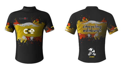
It looks good. Any chance there could be some words tying the panda to POP? Either @PopScotland or Pedal on Parliament or PedalonParliament.org should mean that there's a trail to the website if anyone is interested. Otherwise it's a just a panda on a Brompton. Cool as that is ...
Posted 10 years ago # -
@wc excellent work against your better judgement. :-)
I like the stripe. I think a black jersey with the gold and red single stripe very elegAnt. Still could get sponsored by The Jags.
The splash will get people noticed if that is what the hive mind elect to choose.
On the sizing front anyone used this Jersey company before to establish the fit?
Posted 10 years ago # -
My Ride It Like You Stole It Jersey should arrive in the next couple of weeks, so I'll hopefully be able to give a guide (about the XL) at that point - won't be ordering anything till all of that is settled :)
sally, yeah, working out how to do that with the smaller back pocket position. Can't put text above or below as I think that would reduce the panda too far in size. So wondering if I can have 'pedal on' on one side, and 'parliament' on the other. Trying to be unobtrusive, as some people want the PoP connection, and other don't (I'm sensing).
@gembo, I agree, I'm a fan of stripes :)
Posted 10 years ago # -
OK, I was about to suggest using the actual POP logo (I really need to get that properly onto the website) which has our name on it - but then that would perhaps be TOO poppy for some.
It would be great to have a few mobile POP billboards around the city, but if people don't fancy it then that's fine. We have talked vaguely about doing POP jerseys ourselves but (as you are discovering!) the logistics have tended to get in the way...
Posted 10 years ago # -
Might be that folk are happy with more prominent PoP, but it started with none, had it added on request (given the links between CCE and PoP it's only natural really), had it reduced on request. What's the actual logo? Suspect the Panda is more fun ;)
And yeah, been here before, but not managing multiple colour variations and styles this time! One design, one jersey, job's a good 'un.
Posted 10 years ago # -
The logo is here http://pedalonparliament.org/wp-content/uploads/2012/03/pop_logo.png - it's not as much fun as a panda on a Brompton but it is a bit more obvious what it's about! I'm just checking if that's the absolute official version - we do have an SVG file for it if that's more helpful
Posted 10 years ago # -
Not sure about having so much writing on it. Starts to look more like an A-board than a jersey. The panda is cute, easy to recognise and might initiate conversation with people asking why you have a panda on your jersey?
Oh, and I am not even a fan orange or yellow but they do look good with the black.
Posted 10 years ago # -
Ditto in the would-rather-have-panda-than-writing camp.
Would also buy a PoP jersey, in which case happy to have all the PoP writing desired!
Posted 10 years ago # -
@sallyhinch I still have my PoP flag attached to my bike and have received a few shouts of recognition/enquiries.
I have voted for the panda without any text option for the CCE jersey for the sake of the aesthetics, however.
Posted 10 years ago # -
i think this revised design looks really good.
Posted 10 years ago # -
So, are we doing this?
Posted 10 years ago # -
Cool your jets! ;)
Aye, but need to get the costs confirmed, and then get my other jersey to check on sizing, and then I can launch an order thread. :)
Posted 10 years ago # -
Brilliant. Thanks wc.
That's some birthday presents sorted :)
Posted 10 years ago # -
:)
Posted 10 years ago # -
No pressure, but a shiny new CCE jersey would be perfect to wear for the Pedal for Scotland in early September ;)
Posted 10 years ago # -
This edges closer (though probably not in time for PfS I'm afraid :(
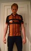
My 'test' Ride It Like You Stole It jersey is being delivered today - wahey! So I'll get to try out the fit, and check the quality. If all of that is good, I'll send the preferred design to them to see how much it would cost, and then I'll re-appear here with costs, and order forms...
Posted 10 years ago # -
Well you get what you pay for. Decent quality on this jersey. Just a very short zip,and I'm hoping that the electric on the arms loosens a bit, but overall very happy. This is an XL, designed for 42" chest, which I am. I'd probably like a little more length in the top (for completeness I'm 6'3"), but for my cross purposes I'll have bib shorts unerneath, so not much of an issue. The printing and colour reproduction is bang on.
So I'm going to go ahead and get costs from them, and will then see about getting some orders in!
Posted 10 years ago # -
Doppler effect to show off your speed? I like the electric arms..
Posted 10 years ago # -
Or to create the sense of speed where none exists?
2 and a half weeks to the next race, so hopefully have some 'action' shots of the jersey - not that I suspect that'll entice any more people to sign up for the CCE version.
Posted 10 years ago # -
@WC just wondering where things are at and if you'd like any help? A jersey would be a perfect Christmas present!
Posted 10 years ago # -
I suppose we've lost WC forever, but would still like a CCE jersey.
this is stylish: https://twitter.com/blackgrlsdobike/status/878969020350963713
makes me think what an Edinburgh version might look like....
Posted 9 years ago #
Reply »
You must log in to post.
 posts
posts