AS noted in the title, this link is a London study, but it's still interesting enough to share and would be something that it would be interesting to see for Edinburgh;
The colour of London's commute
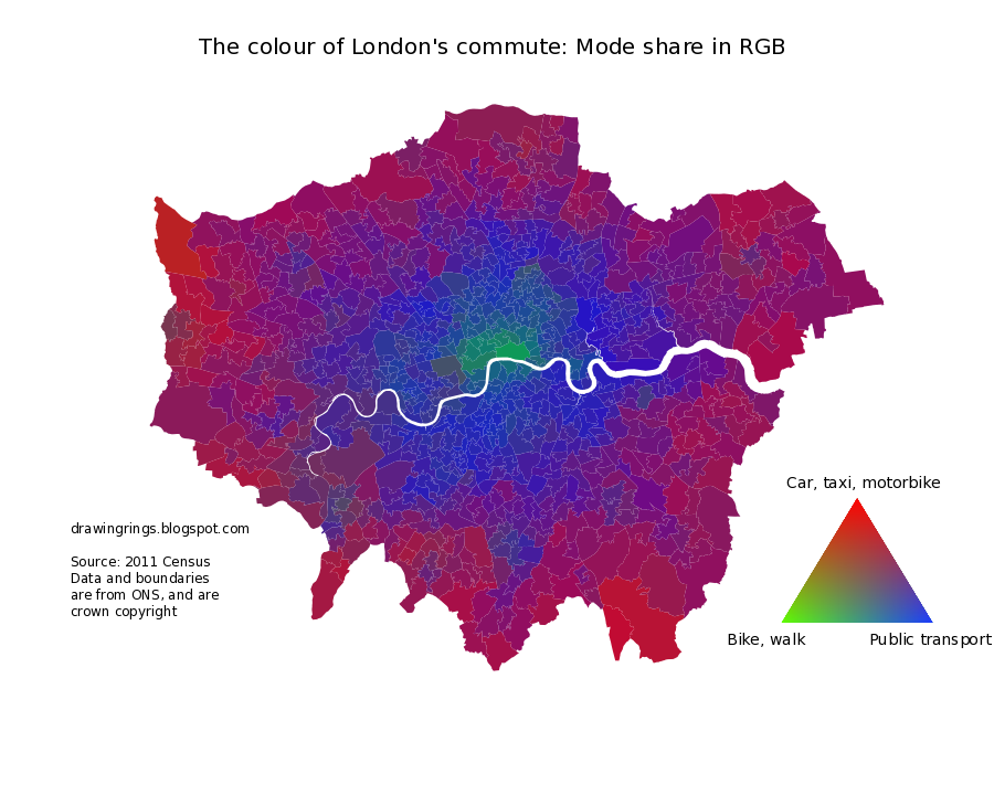
Today saw the release of detailed Census data on, among other things, the mode of transport those in work use to get to work. One interesting aspect of this is the rising level of cycling in London, as described here by Cyclists in the City. I'll probably be looking at that later in the week, but first here is a map which attempts to summarise the transport mix across all of London in a single image.
 posts
posts