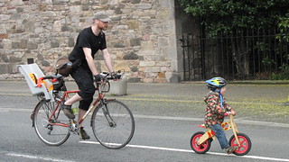
richardlmpearson: It looks like CEC are using colour coded routes, the number 9 is on an orange/brown background (not red like NCN), and route 8 (which I spotted one sign for) has a pink background.
I can see logic in using different colours for each route as well as a number, but perhaps using a circle would have differentiated them better from NCN routes.
CityCyclingEdinburgh Forum » Infrastructure
New Cycle Route Signs
(179 posts)-
Posted 12 years ago #
-
Question: do the CEC colours match the colours on the innerchoob map?
I did kind of deride the concept of renaming paths with colours instead of local names in previous threads.
I still think "Corstorphine Path" makes more sense than the meaningless "Route 9".
Posted 12 years ago # -
 Posted 12 years ago #
 -
Had a response from CEC on the route from Roseburn to the Airport and we have some good news (albeit fixing previous mistakes)
- The cycle dismount sign at the Jaguar garage is a mistake and will be removed and they will install a dropped kerb there later this year.
- A dropped kerb will also be put in at the Shell Garage on Maybury Road / Glasgow Road as highlighed above.
- They will look at the tight chicane between Dovecot Road & Broomhall Road, although they can't force the owners to trim the hedge back as the path hasn't been adopted. I might just knock on their door next time I'm passing and ask nicely. (see other thread - I didn't even try to get the tandem & trailer through this)
- They will be getting the installer (who clearly don't read what they're putting up)to correct the signage this week.
All good stuff, but does make me whether they would be better off publicising what they are proposing to do so that 'we' can comment before money gets wasted on redoing things (ref tread List for Lesley). It's not our job to do it but it may just mean that we get more and better infrastructure for our buck.
Posted 12 years ago # -
oh, and I also spotted this new sign at Pinkhill Station
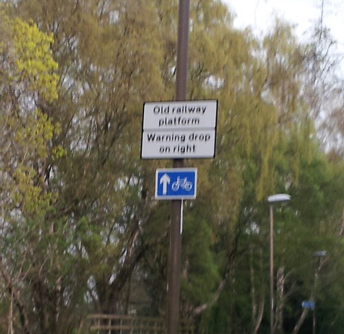 New sign by HankChief, on Flickr
I appreciate that you could roll down the ramp on and then off the platform edge, but it does seem a bit far fetched. Don't know if these are as a result of an 'incident' or just a perceived risk.
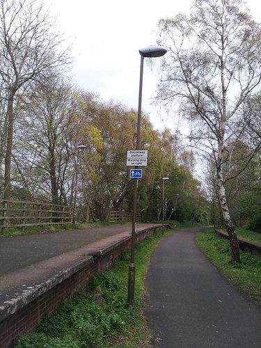 Interesting new sign by HankChief, on Flickr
They are slightly confusing when you are cycling along the railway line from Corstorphine.
Posted 12 years ago # -
That is just stupid.
It's year since that platform was rehabilitated as a 'cycleway'.
It's less than clear that the sign is for people on it!
Also - the point of that cycle sign with the arrow???
Posted 12 years ago # -
Elf 'n' safetea gone mad innit.
Posted 12 years ago # -
Sign making budget not spent by end of March?
this sign not in use?
Posted 12 years ago # -
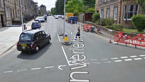
Great example of the contractors not using the eyes in their heads on Inverleith Row (that's route 20 to you). Sign for Botanic Gardens pointing away from them down Eildon Street
Had the contractors actually bothered to turn through 180 degrees they would have noticed the large gates and sign that says 'Botanic Gardens' right behind them. Kind of beggars belief to be honest.
On a related note, the route they have worked out (if you ignore being sent the wrong way and mentally rotate both signs) actually tells you to get off the bike (you can see the dismount request in the picture), wheel it halfway down Inverleith Row to the Botanics, cross over at the lights, then wheel the rest of the way down Inverleith Row to the junction with Inverleith Terrace, where another sign advises that you are now free to remount.
A rather telling attitude that the road is considered unsafe for families to cycle down and then try to turn right...
Posted 12 years ago # -
" wheel it halfway down Inverleith Row to the Botanics, cross over at the lights, then wheel the rest of the way down Inverleith Row to the junction with Inverleith Terrace, where another sign advises that you are now free to remount."
Really??
Posted 12 years ago # -
The cooncil have said in a tweet on friday they'll get the signing sorted. So thats one thing ...... but note that this will then have cost TWO trips hy whatever clowns did this rather than one and seems to be to be a serious waste of public money.
The stuff about dismounting and using the crossing shows how very un-seriously EDI cooncil still take provision for cycling for all their upbeat rhetoric. Infra like this is an utter joke.Posted 12 years ago # -
Plenty of room for proper cycle route -
 Posted 12 years ago #
 -
Even more here -
 Posted 12 years ago #
 -
Does anyone know if there are plans to actually put in any cycling infrastructure along these "routes"? I have cycled the on-road sections of routes 8 and 9, and there are few (if any) any sections of advisory cycle-lane, let alone proper infrastructure.
However, if the plan is to start directing people along these routes, so that CEC can then say "look at all the cyclists, we need a proper path for them" then that is a step in the right direction. Although this might just be wishful thinking.
Posted 12 years ago # -
"Although this might just be wishful thinking."
At present it looks like wishful thinking that many people will choose to use this route.
I hope that any users (new or existing) will kick up a fuss.
Think 'we' need to do a 'study tour'.
Posted 12 years ago # -
Ended up going the wrong way up Shore Place (one way) at Mimi's Bakehouse yesterday as the new sign points you to turn left there, rather than left onto Tolbooth Wynd, which is the way you should go if you want to head for the Links.
Study tours are always good.
Posted 12 years ago # -
Just thought this needed bumping up the forum!

Cycle Route 20 - Wrong Way! by Ben_N1, on FlickrPosted 12 years ago # -
Just spotted a team of men fixing the signs on route 9.
There were 3 of them. One in the passenger seat staring at his phone, one sitting on the openside of the van staring at an ipad and the youngest of the 3 up a ladder with a spanner..
Let's hope they were double and triple checking where Carricknowe is....
Posted 11 years ago # -
It's all change at the Pinkhill Station...
I previously reported the 2 new signs on the lamp posts on the platform

New sign by HankChief, on FlickrObviously not all users can read, so they have gone one better and we now have a picture
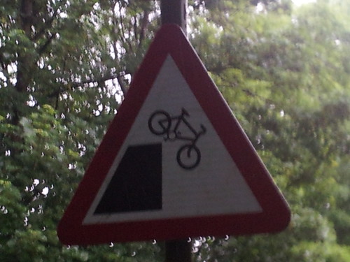
Failing bicycles? by HankChief, on Flickr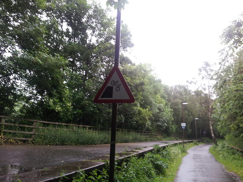
Failing bicycles by HankChief, on FlickrWhat I don't understand is why the triangle sign has been put where you can't see it if you come down the slope.
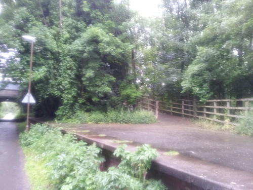
Pinkhill Station by HankChief, on FlickrComing down the slope you just get a written sign.
The triangle is only visible if you are coming from the tunnel, in which case you are on the trackbed and not the platform. Very weird...
Posted 11 years ago # -
Aha. Clearly, it is not a message for the safety of cyclists. Rather, it is a warning intended to protect the coffers of CEC from being sued by people who unexpectedly had a bicycle fall on them from a higher level.
Posted 11 years ago # -
Maybe it's warning people approaching the platform that there might be someone attempting to MacAskill backwards off it? That would be slightly more acceptable than warning people who have voluntarily boarded an old station platform that they might fall off.
Posted 11 years ago # -
Actually the signs used to confuse me somewhat, because they were put on the light columns to the right of the platform edge (and left of the path), and refer to a hazard "on the right" (where it's actually to the left of the signs) - I had originally thought these meant there was some sort of a hidden ditch off to the right of the path.
The same signs could have been used without dubiety if they had been mounted on the left of the platform.
Posted 11 years ago # -
Kap: "The same signs could have been used without dubiety if they had been mounted on the left of the platform."
I think some people can see this intuitively and some can't. It also applies to floor-plans. You would need four differently orientated floor plans for each of the four walls of a square building. I was unable to convince an ex-colleague of this even though we found this approach used in the new NMS building - a pity as she occasionally designed floor-plans for the Council.
Posted 11 years ago # -
I suppose the trouble with putting them on the left though is that you draw peoples line of sight away from the hazard. Or they just totally miss the sign and cycle darwinianly off the edge. How about warning people as they come down the ramp.
Posted 11 years ago # -
How about a fence?
Posted 11 years ago # -
"How about a fence?"
'Too expensive'.
Which is presumably why they don't often put them on cliff edges often...
They don't put fences on platforms - even with trains running past at 125mph, or canals.
A white line might work - but even that is 'H&S gone mad'.
Posted 11 years ago # -
I was unable to convince an ex-colleague of this even though we found this approach used in the new NMS building
Indeed, our property people put helpful A0 maps all around our building (which has a rather complex layout with no corridors), but they orientated them from an architects point of view, which is upside down from the viewer's point of view when facing west (as you would be when exiting the lifts, which are all on one side of the building) therefore sends everyone off in the wrong direction.
Posted 11 years ago # -
A white line might work - but even that is 'H&S gone mad'.
Perhaps a guerilla-stencilled "KEEP BACK FROM THE PLATFORM EDGE".
Posted 11 years ago # -
How about 'Danger Council Sign Inventors At Work'.
Posted 11 years ago # -
Keep back from the platform edge or you may fall off laughing
Posted 11 years ago #
Reply »
You must log in to post.


 posts
posts
