It would appear that the 'sand' is now old hat. Thought there might be a change after their new forks were listed as black or bronze.
May I just say, on the colours and the new text and so on.... Urgh!
CityCyclingEdinburgh was launched on the 27th of October 2009 as "an experiment".
IT’S TRUE!
CCE is 17years old!
Well done to ALL posters
It soon became useful and entertaining. There are regular posters, people who add useful info occasionally and plenty more who drop by to watch. That's fine. If you want to add news/comments it's easy to register and become a member.
RULES No personal insults. No swearing.

You should be pleased, then you can't sulk if all the people you try to persuade to buy one, buy one because at least theirs will look different. :-)
The black one looks okay. The bronze/beige combo though: vile, utterly vile! I can foresee a few remaindered frames being sold off cheap next year, bought and hastily resprayed!
Bit of a price bump too. Both look ok but I'm a little weary of planet x photography after my mates carbon 456 turned out to be barely finished not the gloss black that was pictured.
Hmmm, perhaps the bronze/beige one is deliberately looking like dog poo to remind us of what is on some paths.
And the black / red combo might as well be a specialized (nothing wrong with that, I have one), such is the 'look at me' brash nature of the logo.
White / silver writing on a custard-coloured background? Clearly the Planet X paint job designer didn't attend the first day of graphic design school.
I dislike that more than the overall scheme - which just looks to me a bit like the last scheme but inverted.
Agree the red and black one is handsome, but a bit too "mainstream" to stand out. A British Racing Green one would have been much better.
You must log in to post.

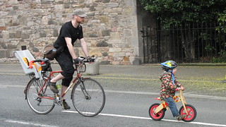 Cycling in Edinburgh Flickr group
Video embedded using Easy Video Embed plugin
 posts
posts