
This could be a little OT but I think a few of you may be interested. Without wanting to plug Google, their insights tool is fascinating. It allows you to see how frequently search terms have been used over time and you can restrict e.g. according to region.
So for example, the graph below was produced using the search terms "bmi" (blue line) and "cycling" (red line). BTW user beware! The consistent spike for bmi in the new year is interesting as is the apparent fall off. The cyclical (hah hah) effect for "cycling" is quite clear - the peaks are in July or August. This seems to have changed this year - perhaps not a surprise!
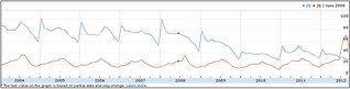
I don't think that you can graph different countries together in this tool but you can download the data and plot it yourself. I have had a quick look at a few other western countries; they generally show summer peaks in interest but not the 2012 surge that we saw here. Some countries show a downward trend but I would be cautious about interpreting these for various reasons.
 posts
posts