"
CTC Scotland (@CTC_Scot)
11/02/2013 18:53
Cyclists' Touring Club Scotland (CTC) the Scottish cycling charity - new logo
"
Good idea?
CityCyclingEdinburgh was launched on the 27th of October 2009 as "an experiment".
IT’S TRUE!
CCE is 17years old!
Well done to ALL posters
It soon became useful and entertaining. There are regular posters, people who add useful info occasionally and plenty more who drop by to watch. That's fine. If you want to add news/comments it's easy to register and become a member.
RULES No personal insults. No swearing.

"
CTC Scotland (@CTC_Scot)
11/02/2013 18:53
Cyclists' Touring Club Scotland (CTC) the Scottish cycling charity - new logo
"
Good idea?
it's the old logo, isn't it? With a painfully awkward new typeface? That kerning's enough to make a typesetter cry.
Does cycling need charity ?
Admin edit
http://citycyclingedinburgh.info/bbpress/topic.php?id=9476#post-100000
The logo doesn't make sense. The name and description are inconsistent. Either it's ctc (*) and it's the British cycling charity, or it's ctc (*) Scotland and it's the Scottish cycling charity. The ctc (*) isn't a Scottish cycling charity.
* wince
Also, the ctc UK slogan - "the national cycling charity" - could be quite apt for ctc Scotland :-)
Oh well. Whatever.
I quite like the main text of the new logo, a bit like a condensed Century Gothic.
Should cycling (nationally) perhaps have its own typeface, though? There's Transport for road signs:
![]()
and Rail Alphabet:

and Johnstone for TfL and the London Underground:

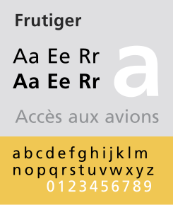
and Frutiger for the NHS:
Jock Kinneir and Margaret Calvert (who designed Transport for the Warboys Report Road Signs that we still have today) also designed the slightly more utilitarian Rail Alphabet for British Railways rebranding to British Rail in 1964ish.
Unfortunately some well-meaning person at the DfT has abolished the requirement to use this as the only typeface on the railways, and a whole bewildering array of alternatives have sprung up thanks to the branding chumps in each franchise. Some of them are frankly inadequate in their intended roles.
I would have thought that what with all the effort to comply with legislation for the partially sighted (painting every train door in non-heritage rolling stock a contrasting colour to the carriage body) that a recognised, highly legible, standardised typeface would have been a bonus. I struggle to read some of the Scotrail signs at a distance.
Rail Alphabet was also used on that peculiar background shade of grey-brown by the NHS.
The thing is, outside of overpaid rebranding consultants, graphic designers and the poor sods who have to apply slightly different fonts, very, very few people could give a tinkers cuss as long as it's legible..
(@Kaputnik, point noted about illegible Scotfail signs)
There are pointless rebranding consultants and then there are fabulously talented graphic designers who can come up with such things as the Rail and Transport Alphabets - taking a scientific approach toensure that they maximised the legibility - and yet still came out with something as handsome as instantly recognisable as they did.
It took Calvert and Kinneir some persuasion to convince the MoT as it then was that a sign is more legible written in lower case than in upper case, there wasn't much understanding of the recognition of word "shapes" vs. actually reading the letters one after the other and working out what it says. Obviously with upper case, all words basically have the same shape, but with lower case the brain can process the outline created by the differnt letters in a flash and tell you what it is most likely to say. This was very important at the time as traffic speeds were increasing therefore the amount of time available to read a sign as you passed it was decreasing.
They created a separate typeface called Motorway which can only be used for the route numbers of trunk roads. Again this was for simple reasons of increasing legibility for a driver passing the sign at high speed - numbers are recognised differently from words, so the best way to do it was with a specific typeface.
It's interesting to note that US road signs use a typeface that isn't particularly legible in comparison. I read somewhere that in recent years they have changed to a typeface somewhat more like Transport.
Margaret Calvert probably got the best ever gig in the history of British design when she was asked to design all the pictures for UK road and street signs back in the sixties. The cow in the "farm animals" sign is based on a cow from her parents' neighbour's farm. The little girl leading the boy across the road for "children crossing" sign is based on Calvert herself. She took great exception to the sign that she replaced, which had a typically lower-upper middle class looking pair of school children and the boy leading the girl, so decided to do something about it.
Absolutely right, design criteria of maximum legibility, resulting in classic and functional designs (esp when combined with talented designers).
Changing the font etc for a "new look" however...
I would still contend that outside those with a specific professional interest 99% of people have no interest in the typeface/font on most signs other than whether or not it is easy to read. Witness the number of people who accidentally produce letters/documents with a mix of fonts without they or their readers noticing.. (Times New Roman and arial mix is particularly common at my work as the official standard is arial 11pt for legibility but there are still a lot of Times New Roman documents about...)
t there are still a lot of Times New Roman documents about
Actually a much better typeface for producing a document in for ease of reading. But never mind! We're saddled with Arial too at work and corporate branding geniuses who provide us with "templates" but don't know how document styles work.
Kinneir and Calvert also had to push the idea that less is more in symbols design. That had started with Otto Neurath in Germany but became increasingly important as road speeds increased.
I used to design symbols and we ran into all kinds of weirdness. We once got a cease and desist from the Ministry of Defence for using a red cross on a sign.
Hmm. I was always taught that you used a san-serif font for headings and a serif font for text. Hence the Arial/Times mix (which used to be the default document template in Word if I recall correctly). Of course that was back when the assumption was that most documents would be printed out before they were read - it might be the case that san serif fonts are clearer on the average screen than serif ones
Our work has it's own corporate typeface, designed by some consulatancy many years ago for lots of cash. A stupid idea, but may have made more sense when you only distributed stuff externally in printed form.
I think only marketing use it these days.
BBC article on Calvert's work:
My employer spent millions about 10 years ago undergoing a massive rebranding from Helvetica to Arial. Probably only a real design nerd can tell the two apart at a glance, and then all of a sudden Helvetica became the new uber-cool typeface to have after Gill Sans became hopelessly over-exploited about 4 or 5 years ago. Helvetica of course is now back out of favour too for the same reasons.
Going massively off-topic, the whole Gill Sans revival thing was the fault of the BBC, who found that their late 80s / 90s italic logo didn't work when shrunk down to be used as an ident in the corner of the screen. The colours and the slanted lines misregistered, so they commissioned something with only vertical and horizontal lines, no colour and no italics.
"I used to design symbols and we ran into all kinds of weirdness. We once got a cease and desist from the Ministry of Defence for using a red cross on a sign. "
@Tom, a "protected symbol" officially if I'm not mistaken, along with the red crescent, red diamond and others. I guess they have to be exclusive for clarity.
the whole Gill Sans revival thing was the fault of the BBC
To be honest, I still hanker for the cut-glass days of This is the British Television Service, with the slanty logo that looked like Cooper Black.
I think my brain is wired differently. I prefer reading fonts like Arial, rather than Times New Roman (I know I know, TNR is supposed to be easier on the eye). But yes, a pet hate of mine having different fonts all over the same document!
There's a Scottish Power "danger of death" sign on a substation near the Foodies Cafe at Holyrood that's in Comic Sans I kid ye not. Should get an award for the least official looking official warning sign.
I believe Comic Sans is one of the easier read fonts for dyslexic individuals. Maybe there was study...
We are told to use Comic Sans in school. I hate it.
On the plus side it does mean I set the styles up so that I can change it easily sometime in the future.
Smudge: "a "protected symbol" officially if I'm not mistaken"
Oh yes, we were left in no doubt about that.
The old Jewel and Esk College in Eskbank used to have a speed camera symbol to indicate that CCTV was in use in the canteen. Made me laugh.
I always thought the "bent bike" logo was outdated almost as soon as it was hatched. This new one does not change my mind. It does call in to question whether a charitable organisation (the extent of charity apparently being to sponsor a racing team) should be spending out on tweaks to logos instead of carrying out "good works" with the money.
@Blueth if they spent any money on that at all, I'd be surprised, and they should definitely be asking for a refund!
Font selectability for CCE anyone?
Does BBcode support it?
One fish, two fish, red fish, blue fish. I don't think BBcode supports different fonts though.
Of course, you can use the {size=n} tag, albeit sparingly, as in:
"Hello, my name is Brian Blessed!."
Font selectability for CCE anyone?
I think a mutual consensus was long-ago reached that one of the charms of CCE was its lack of autosignatures, smileys, animated GIFs and loud/obnoxious formatting.
I'm not sure if it was by design or an accident of semi-functional BBpress code, but it's how we ended up.
I think a mutual consensus was long-ago reached
I particularly like the DIY quoting that many of us use when replying.
And yes, you tend to forget how uncluttered CCE is, until you're presented with animated avatars and huge, screen real estate-eating images in signatures. I've ended up blocking certain images on other forums for exactly that reason.
You must log in to post.

 Cycling in Edinburgh Flickr group
Video embedded using Easy Video Embed plugin
 posts
posts